After completing Thing 7
Phoebe is an online tool intended to encourage university teachers to explore new approaches and tools in their pedagogy. It does this by providing online course design templates, which course designers fill out with the help of accompanying suggestions and examples.
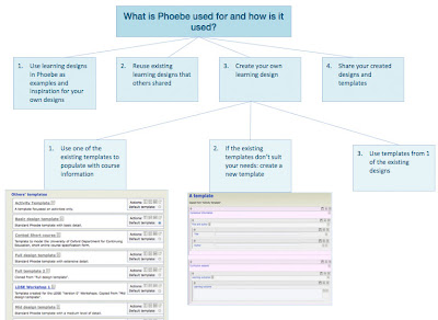
The templates are basically forms, with a series of sections and text boxes into which information concerning aspects of the course is entered. Each section and text box can have supporting information associated with it and displayed during editing to help the designer. The built-in templates are mostly about design at the class or lecture level and draw on course design resources developed by the Phoebe team specifically to accompany them, but it is equally straightforward to link to other resources.
The different templates are provided to suit different kinds of course and levels of detail. Some are built in, but many have been created and shared by other course designers.
To make a new course design, you choose an appropriate template, click the 'create new design' button and set about filling in the various text boxes, aided by the prompts and help text. For this the screen is split in half, with the template on the right side and wiki pages on pedagogic practices on the left. Alternative views are available in case you prefer them to the split-screen layout.
Phoebe could be helpful on a number of levels. By requiring a particular set of fields a template can help designers break design problems down in a tractable way, make designs more comparable and explicit, and prompt designers to consider aspects they might have overlooked.
Created at Oxford University, Phoebe is a prototype and is not being developed any further, but it is still live and usable. The ideas and benefits of Phoebe could be obtained in a variety of other ways also, but being open source it would be possible to have a version just for Cambridge.

How is it used?
Don't let Phoebe's overwhelmed by the wordiness of the Phoebe system, once you've understood what it's about, it's really not that hard. This is usually the case with many online systems anyway. Have a look at the video below to get an idea of how Phoebe is used:
Step by step instructions
Blog Thing 7
If you're interested
- You will know what 'Phoebe' is for
- You will have investigated Phoebe's built-in and user contributed design templates
- You will have reflected on how useful it could be for you
Phoebe is an online tool intended to encourage university teachers to explore new approaches and tools in their pedagogy. It does this by providing online course design templates, which course designers fill out with the help of accompanying suggestions and examples.
The templates are basically forms, with a series of sections and text boxes into which information concerning aspects of the course is entered. Each section and text box can have supporting information associated with it and displayed during editing to help the designer. The built-in templates are mostly about design at the class or lecture level and draw on course design resources developed by the Phoebe team specifically to accompany them, but it is equally straightforward to link to other resources.
The different templates are provided to suit different kinds of course and levels of detail. Some are built in, but many have been created and shared by other course designers.
To make a new course design, you choose an appropriate template, click the 'create new design' button and set about filling in the various text boxes, aided by the prompts and help text. For this the screen is split in half, with the template on the right side and wiki pages on pedagogic practices on the left. Alternative views are available in case you prefer them to the split-screen layout.
Phoebe could be helpful on a number of levels. By requiring a particular set of fields a template can help designers break design problems down in a tractable way, make designs more comparable and explicit, and prompt designers to consider aspects they might have overlooked.
Created at Oxford University, Phoebe is a prototype and is not being developed any further, but it is still live and usable. The ideas and benefits of Phoebe could be obtained in a variety of other ways also, but being open source it would be possible to have a version just for Cambridge.

How is it used?
Don't let Phoebe's overwhelmed by the wordiness of the Phoebe system, once you've understood what it's about, it's really not that hard. This is usually the case with many online systems anyway. Have a look at the video below to get an idea of how Phoebe is used:
Step by step instructions
- Visit Phoebe here
- So that you can create and save templates and learning designs create an account by clicking on Register/Login at the top of the page and filling out the various fields. You won't be spammed.
- Log in
- Click on 'Manage your design templates'. You'll see a section called 'Other's templates', which is the list of all the public design templates. Some of them are created by the Oxford Phoebe team, others are made by users and made public.
- Chose one or more templates to try for yourself (you might be interested in 'Cambridge Course handbook'). Click the 'create a design based on this template' button for your favoured template. You will be asked to give your new design a name and description and then you will be placed in the design environment, complete with support material.
- Try out the design editing environment for yourself. Click the 'click for guidance', 'click for book' and 'click for example' buttons to call up associated help for each field.
Blog Thing 7
- What was your initial reaction to the idea of standard template forms with built-in help, as curriculum design tools?
- After having tried it yourself, how did your impressions change?
- Which template(s) did you think were useful? Would you consider creating a template yourself?
- If you looked at a new design using the Cambridge Course Handbook template, how well do you think it could the module design process, or to improve the consistency of module information, or both?
- What are your thoughts about using a standard to share Cambridge (or your course) specific templates and designs; as a tool to share your learning designs?
If you're interested
- Create a new design based on one of the templates and try using it to describe a course you are familiar with. When you're done, make it public and tell us its name in your blog.
- Create a template yourself: specific to Cambridge or even to your course. When you're done, make it public and tell us its name in your blog.
Phoebe is an experimental tool, no longer in development, but we included it because the idea of producing consistently structured course descriptions is one which could be implemented in any number of ways. Phoebe also made it relatively easy to prototype a form derived from a sample of Cambridge course handbooks, linked to Education Committee guidelines and University of Cambridge examples, and tweaked to maximise the possibilities for re-using the information by presenting it in other places and formats and linking it with other Cambridge services such as the UL. We were also interested in people’s reactions to the parallel links to relevant suggestions and guidelines.
ReplyDeleteReactions to Phoebe were largely negative, but this may be partly attributable to a deficient introduction. We didn’t make clear that to get the full experience it is necessary to register on the site and create a new course design using this template, and we didn’t give our own motivations, or even the derivation of our “Cambridge Course Handbook” form, leaving our respondents to take the tool at face value and work out for themselves how it might help.
mrj10, understanding the tool as its designers meant it to be understood, i.e. a customisable template with built-in help, for personal use, was cautious about the value of having a form, especially balanced against the time investment needed to customise one: “Many of the headings in the template seem sensible considerations in planning a course, but I could imagine finding them quite constraining and I am not sure how much I would gain by filling them out ... the more customisation that is involved, the greater the cost of using a tool and the less likely I am to use it unless there is a significant benefit.” One of the benefits of Phoebe is supposed to be the parallel display of guidelines and recommendations relevant to each field, but owing to our poor instructions I think mrj10 didn’t encounter this.
[Continues...]
[Continued...]
ReplyDeletePhoebe is quite general-purpose but its unmodified form templates, guidelines and recommendations are directed towards providing “timely and informed guidance on designing learning experiences that make appropriate use of technology”. mrj10 objected that in this “There was a certain element too of technology for technology’s sake ... While the “appropriate use” could no doubt be argued as using technology when appropriate, there is a sense that learning experiences ought to be using technology. Yes, you could use Instant Messaging, podcasts or mobile phones for students to receive instructions, but you could also just tell them in class.” This is a lesson the learning technologists everywhere have learned but its always worth reiterating: focus on supporting effective learning and teaching.
To be fair to the Phoebe team, they are clear about their agenda, and go on to say “we envisage Phoebe above all as a community tool, owned by individual departments and colleges who will supplement the advice and examples that we have supplied with material directly relevant to their own context."
Socratic Investigations wasn’t buying any of this, likening it to a Trojan horse: “I cannot help but doubt whether a divinely neutral or pure tool descending upon departments of academic learning uncalled-for from the summit of the mount of bureaucracy might not prove, upon careful reflection, to be fundamentally unhelpful.” Giving Phoebe the benefit of the doubt, Socratic Investigations was prepared to concede that it could work as a way of sharing course outlines, but only if the goal is not “to synchronize/monitor all educators within a network of bureaucratic expectations” and only to save time and increase transparency. “Compared to [other tools] we have been presented with, this one seems to have the greatest potential for obtaining its goal. Here, a menu of templates for course outlines is (or can be) presented for an educator to select and fill out one template, just as he would with most other online forms.”
The conclusion I draw from Phoebe is not so much about the value of sharable, consistent course description templates with built-in help, as about how the acceptability of new tools to the academy. CARET should not shy away from saying why it thinks new tools are useful, focusing on their benefits for students and teachers. Academics don’t like being told what to do, but they also appreciate an efficient organisation which minimises bureaucratic demands on their, making forms a battleground of conflicting desires.
An effective approach is, as far as possible, to do only what is already being done. My feeling is that if Socratic Investigations had been aware that the “Cambridge Course Handbook” template was simply modelled on common elements of existing course handbooks, they would not be asking “our new Phoebes to show me before all else why my department would need to change the way it has been or currently is presenting course outlines.”