- You will know what Viewpoints is all about
- You will have reflected on how it can be useful for you
- You will have tried applying it to one of your own courses
Viewpoints is a tool developed by the JISC-funded curriculum design project at the University of Ulster. The tool can be used during or at the end of a course/lecture/module/term in order to assess and improve it..., or it can also be used before designing a new course/lecture/module... in order to help you focus on different (pedagogical) principles.
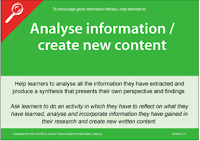
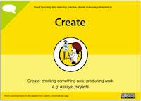
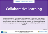
In order to do that, Viewpoints makes usage of a set of cards, divided into different categories (Assessment & Feedback, Information Skills, Learner Engagement, Creativity in the Curriculum).
 |
| Different sets of Viewpoint cards |
Each category exists out of a set of cards which basically represent different specific aims, objectives or activities that can be undertaken to fulfill that pedagogical principle and that you could consider including in your curriculum. Each card can also be turned over, which uncovers a whole set of practical activities that can be done in order to reach that goal.
Click on the following links to have a look at the (front and back of the) different sets of cards:
Assessment & Feedback cards
Information Skills cards

Learner Engagement cards

Creativity in the Curriculum

How is it used?
There's the original idea of Viewpoints, which is using a set of paper cards. However, that paper version is not always easy to work with as it involves a lot of printing and lots of note taking etc. Therefore, CARET also made an online prototype version (so still a bit of work in progress) of those same cards.
Although there's the difference between paper and digitalised cards, the method and overall idea is still the same.
The Viewpoints cards are intended to be used during a collaborative exercise where a group of people related to the same course (course organisers, lecturers, and perhaps even other people) would sit around a table with 1) all the sets of cards spread out over the table, and 2) an A1 print out of a timeline worksheet. This timeline allows people to divide the course/package they're focusing on, into different time slots; these headings on the timeline could be in weeks (e.g. Week 1 or Week 1-5), by mentioning the terms (Michaelmas,...), by mentioning the name of the Module,... and so on.
The people around the table would then discuss and come to an agreement of what the different aspects should be that have to be included, following these steps:
- Explore, discuss and decide on cards
The front side of all the cards are spread out over the table (somewhat clustered together), as well as the big timeline worksheet.
First of all, the information on the timeline should be filled out (i.e. deciding what the different time definitions should be; weeks/ terms/ module name etc).
Then the different cards should get explored by the members and by collaboratively brainstorming, the different cards get decided (e.g. one could choose to have 'Give assessment choice', and 'Encourage interaction and dialogue' and so on.)
At the same time, these cards can already be connected to a specific timeslot (e.g. members could decide that it's better to have 'Encourage interaction and dialogue' in 'Week 2-5' for example). - Turn over cards and decide on activities
Once decided on the main 'action points' (i.e. the different cards and those being linked to a time slot), the selected cards get turned over.
On the back of each card there's an overview of practical activities and tips you can undertake in order to achieve that main 'action point'.
Again it's good if the participants collaborate, discuss and decide which activities should be selected for that action point. Realistically, you probably won't select all of the activities/tips, but probably about 3-5 maximum.
As it's a discussion, it's possible the team decides to leave some cards out after all, and it's good to prioritise the activities too; i.e. which of the activities/tips will you do first or are more important? - Collect activities and action points into a workable checklist
You probably want to note down all these points where you'll be drawing attention to.
The paper version of the Viewpoints cards is somewhat cumbersome because you would now need to write down everything in a workable checklist, which you can then afterwards incorporate into your other course documents.
The online version is much easier in that aspect that it automatically collects the set of information you ticked and saved into a printable document.
Step by step instructions
The online version is still a prototype, which means not everything is there yet (for example, only the 'Assessment and Feedback' category is in there at the moment) and some things might not work smoothly enough for you yet.
Therefore, we'd like to hear how it works for you and what should definitely improve on the overall ideas. Ideally this whole Viewpoints exercise should be carried out as a group exercise as in reality, a curriculum won't be changed by just one person but by a whole group of people who're involved. However, for this exercise and just for you to get an idea of it, it's already useful to explore it on your own.
- Visit the online version of Viewpoints cards here.
- Imagine you'd like to change the curriculum design for your course/ module / lecture..., or you could think of an old one which could need some improvements.
Fill out the arrangement (which basically stands for the name of the 'course/ project/ module etc'). - You'll now land on the arrangement tab, which is the place where you'll do the main bit of the exercise: defining the timeslots (terms/ weeks/ modules), choosing the cards by dragging and dropping them into the appropriate timeslot.
Don't turn over the cards yet; this stage is really first about deciding on the big action points. - Now turn over the cards, explore the different activities/tips and select the ones which are appropriate or which you think should defintely be included. Realistically, you'll probably just select about 3-5 items per card as selecting all the items isn't feasible.
At this stage you can also still decide to leave out some cards by deleting them, if you think they're probably not appropriate after all.
You can also drag an drop the cards, as well as the individual activities on the back of the cards, into the right order (i.e. the most important ones could be dragged to the top). - Click the Finish button. You'll now see a checklist of all the items you selected. You can also save and print them out if you want.
Blog Thing 10
Below are again some questions about this Thing.
As Viewpoints cards exists in a paper version as well as an online version, we'd like you to review the whole Viewpoints idea, with particular focus on the online version and how that could be improved. Feel free to give your honest feedback on any usability issues/problems or vague wording...things that confused you on the online version; or give a comparison for each...whatever suits you best.
- What do you think of the ideas behind Viewpoint cards?
What was your impression (of the idea as well as the online version)? - In what way do you see this being useful to you as a course organiser? Would you consider using it (either the cards or the online version) when you would (re)design a course?
- Using the online Viewpoints cards, did you find it illuminating or frustrating?
Are there any ways you would change it to better reflect what you want to do (e.g. wording, whole idea or concepts that don't work for you)? - What tools do you currently use when (re)designing a course? How do you compare Viewpoints with those you're already using?
- Currently the online prototype has the biggest category in there (Feedback & Assessment).
Have a look at the other sets of cards as well, which you'll find in the beginning of this blogpost.
Do these sets (and the specific activities and hints at the back of the cards) make sense to you? Do you think they're useful for you or Cambridge needs?

Of all the 13 Things, Viewpoints is the one in which we had greatest confidence. It’s creators’ relentless focus on practicality caused them to abandon their own online version and develop the tool as flip cards for use in a curriculum design team workshop. Also, it has received glowing reviews from course teams at several universities who have found it highly stimulating and constructive when used in an early meeting of a curriculum design or review process. CARET has prototyped this online version in an attempt to capture some of its benefits for the more fragmented Cambridge curriculum design context.
ReplyDeleteSocratic Investigations makes a nice argument about the potential invalidity of brainstorming as “an appropriate strategy for enlightenment”, adding a second rank of objections including that it is too prescriptive and constraining - “most things in life and academic courses alike don't fit pre-established grids ... thought is not born piecemeal or pre-packaged ... I see no reason why it should end up that way, either ... I would prefer to think out course objectives off any handy grid. The time for desirable cribs has passed, for me.” mrj10 disliked the grid also : “I’m not sure that I would necessarily be bothered with the timeline, though, as I don’t (currently) see that it makes much sense to think in terms of activities having a particular timeslot e.g. “Encourage interaction and dialogue’ in ‘Week 2-5″. I would usually want to encourage interaction and dialogue in every class, perhaps at particular points, not just in certain weeks.”
The Viewpoints ‘grid’ is intended as a very rough compositional guideline, with columns for the ‘beginning’, ‘middle’ and ‘end’ of the programme, in which Viewpoints cards of interest are placed. During workshops people freely cross the lines, but it’s true that is hard in our online version.
It is important to understand also, as perhaps we didn’t make very clear in our introduction, that Viewpoints isn’t a complete design resource. It has sets of cards for its several and eponymous viewpoints, designed to provoke discussion around a particular desired design feature or problem, and when flipped over provide some suggestions for how to tackle it.
Socratic Investigations did not like the suggestions, recalling an earlier suspicion that learning technologist’s aims are not compatible with educators’: “There probably ought to be guidelines, but these ought to be set by a government accountable to reason, and not by bureaucrats hiding behind the persona of reason”. mrj10 was more positive: “I quite liked these. They had reasonably clear and concise descriptions of things to try to support particular types of activities, but didn’t seem prescriptive ... I might want to browse a few cards when I am thinking about new or different ways to deliver or assess some material ... The cards about what the lecturer should do themselves (rather than what they should try to inculcate in the learner) seemed better.”
In terms of how it might best used at Cambridge, mrj10 suggests “Having it online would save trees and allow personalisation, but giving a printed set to all new lecturers might symbolise institutional encouragement to reflection on teaching better.”
mrj10 also recalls an earlier theme of his own: “Viewpoints (and most of the other curriculum design tools we have seen in 13things) seem more about curriculum delivery than curriculum content (which, as I have commented before is what I find more challenging).”
My conclusions from this Thing are that for individual use it is probably another ‘love it or hate it’ tool, and that we our prototype needs a few rounds of development. We need to make it as flexible and easy to understand as the card version, and perhaps incorporate some sharing features to make it easier to invite colleagues’ opinions.