Monday, 26 September 2011

What we learned from 13 Things, and what we're going to do about it

We tried to make sure our participants could take away something useful from the 13 Things programme, but we also had our own vested interests.  For us the really interesting part was to get feedback from Cambridge teaching staff about the curriculum design tools; what was good, what was bad and what they could use.  We've worked through all the 13 Things summarising the feedback from each.  This post is a summary of what we think we've learned from that, and what we're going to do about it.

Summarising 13 Things

Look out for this writeup also in a forthcoming edition of the Learning and Teaching Support initiative’s newsletter.

Introduction (for anyone who didn’t follow the programme)

If you’re a lecturer, course organiser or teaching committee member then one of your responsibilities is updating and improving courses.  That might involve adjusting content, co-ordinating with other lecturers and departments, improving teaching and assessment methods, changing schedules - any aspect of curriculum design.  A number of universities and funding agencies have in recent years developed technology help you.

Organised by the CourseTools project at CARET and the Open University’s Learning Design Initiative, both funded by the JISC, the 13 Things for Curriculum Designers programme invited Cambridge staff to try out a selection of these tools and share their impressions.  The programme ran for 7 weeks from March into May this year, introducing two ‘Things’ a week and asking participants to spend half an hour experimenting with them and then blogging their responses to four general questions:
  1. What were your initial impressions of this tool?  
  2. After getting to know the tool, were your expectations borne out or were you surprised?  
  3. In what ways do you see this being useful to you?  
  4. How could it be improved?

Because a ‘14th’ Thing was the usefulness of forming a network of peers interested in teaching and learning, informal lunchtime meetings were held before, after and during the programme. 

This format was adopted from the University Library, which ran a “23 Things” programme about web technologies for librarians last year.  In contrast to 23 Things’ didactic purpose, 13 Things was designed as a dialogue, the purpose of which was to find out what kinds of tools succeed in making life easier for teaching staff at Cambridge.

Conclusions

An exercise like this can only produce a collection of opinions, but the thoughtful reflections of 13 Things’ participants support some extremely useful preliminary conclusions, or at least educated hypotheses, about what kinds of tools are helpful for curriculum designers:

  • Clear benefits and minimal learning curve.  Time-pressured academics are happy to pick and choose from new possibilities, but only if it is easy for them to make a cost-benefit calculation.  For example, course visualisation tools split opinion, but because they were easy to understand and decide it may still be worth offering them.
  • Practical. All of the tools presented were motivated by interesting ideas.  Those that failed the test of being valuable to teachers did so on grounds of being inaccessibly confusing, unsubstantiated, immature, or populated with material of variable quality.  CARET should reject such tools and continue to be led by user needs.
  • Curated, high-quality teaching resources with a high relevance quotient.  Collections, whether of teaching and learning techniques and case studies (like the LTS database), or of teaching materials, need to be up-to-date, well publicised and carefully selected.
  • Cambridge specific.  Cambridge’s teaching approach is unique and curriculum design tools developed externally usually need tailoring to fit.
  • Aid consistency and accessibility of course information.  Easy to find and compare course information isn’t only useful for students, it saves time for curriculum designers.  
  • Peer support.  Many participants said the most useful thing about 13 Things was the opportunity to meet up and discuss teaching and share experiences.  

The immediate outcome of all this is to help CARET’s CourseTools project identify and improve useful tools, which will eventually be offered to the whole University.  In the near future CARET will also look in to trialling an ‘online course handbook’ for one or two interested departments, possibly working with MISD to integrate it into CamTools. In parallel the LTS will be considering whether and how to develop its database of practice and networking and peer support aspects, and how CARET might complement this with an online discussion and sharing tool.

Once again our thanks to all our participants for their invaluable help.  We will continue to learn from any further feedback you post!

You can find all the feedback summaries and these conclusions on the blog's Resources page.

Wordle of our summaries of the feedback from all 13 Things


Tuesday, 10 May 2011

Thing 13 - The last post

After completing Thing 13
  • You will have reflected on the programme and the different Things
  • You will have...finished! Time to party!
cc Defense Images, Flickr


But first...

Take a moment to look back over the Things, here and in your own blog. Don't forget to check you blogged all 12 of them (and don't forget there's still this one to add)! Our Things have all been about curriculum design, but putting the Things themselves to one side, think also over the programme itself, and how you've engaged and interacted with it.

Blog Thing 13


About the Things:

  1. Which Things, or kinds of Thing, or just ideas, did you find most useful, or thought-provoking? Why those ones in particular?
  2. Which didn't you find useful (at all)?
  3. Are there any Things or ideas you think you will use in future?
  4. Were any useful enough that they'd be worth mentioning to other colleagues, or promoting or offering more widely in the University?
About the programme:
  1. Looking back over the programme, what were the good bits about it for you? Ideas, tools, dialogue, reflection, something else?
  2. What could have made it better?
  3. What do you think of the idea of an informal forum or network, for Cambridge staff interested in teaching and learning ideas? Is there a need? Would it interest you?
  4. If 13 Things were to continue, in some form, what should that form be?

Gather your thoughts together and make your last post.

If you're interested ... Pimp your last blog post!

We'd like to introduce Wordle. Wordle doesn't necessary have to do with curriculum design but it's a fun way to summarise documents or blog posts by showing what words got used most.

A Wordle word cloud of this blog

  1. Go to Wordle and click on "Create".
  2. Paste in the URL of your blog, click submit and watch for the result (this may take a few minutes, especially if you have posted lots). You can restrict the content to a single post if you prefer: just enter the specific URL of that post, rather than the general URL for your blog.
  3. You can play with the display using the toolbar at the top until you are happy with it, but don't navigate away from the page or you will lose it. If this happens, just re-submit the copy.
  4. When you are happy with your word cloud, simply take a screenshot of it, save it as an image format, and upload it to your blog.

Congratulations

You've survived the entire 13Things programme!

To celebrate we're organising a gala prizegiving ceremony with again lots of food, and prizes. All Cam13ers are welcome regardless of whether you've finished. Everyone who has finished qualifies for their Amazon voucher. To give everyone a chance to catch up the gala prizegiving will be a bit later; towards the end of May. We'll get in touch soon to organise when.


Friday, 6 May 2011

Thing 12 - LDSE

LDSE logo
Thing 12 is one of the most complex Things to introduce, but bear with us and hopefully you'll find it repays investigation. 

After completing Thing 12
  • You'll have experimented with using LSDE to design a module or lecture
  • You'll be aware of its underlying aims as a pedagogic design tool
  • You'll have an updated opinion about the usefulness of such tools
What is LDSE?

The Learning Design Support Environment is free-to-use desktop software for lecturers.  It lets you model a module or session in a way that makes it easy to experiment with different approaches.  As you experiment, it automatically generates an analysis similar to Thing 5's Pedagogy Profile which you can use to help you compare different approaches. You can choose to start a design from scratch, from another design, or from someone else's design.  Sharing designs is straightforward - just save the XML-format file and give it to whoever you want to share it with.

The project is funded by the EPSRC and ESRC under their Technology Enhanced Learning programme and has involved computer scientists, educationalists and learning technologists from six HE institutions, including the Oxford team that developed Phoebe (Thing 7).  LDSE has kept the well-received bits of Phoebe and other previous tools, while putting a lot of work into improving usability and developing the conceptual underpinnings.  In a few minutes you'll get to judge for yourself how well it has succeeded.

Two more things are worth pointing out.  One; LDSE is a project not a product - it's still a bit of a prototype.  The team is collecting feedback now, so your blog posts will help them decide how to continue.  Two; the main reason for LDSE existing is to help lecturers take advantage of new technologies.  All the labour-saving design re-use and drag and drop is just a means to this end; it lets the software know something about what you're doing, so it can highlight pedagogic principles which you can apply to decisions about how technology might enhance your teaching.


Learning Design Support Environment from LDSE on Vimeo.

How is it used?

The tool's focus is 'sessions', which might be lectures or seminars, or more extended work like field trips or unsupervised study.  Future versions may add 'modules', assembled from groups of sessions, and 'teaching and learning activities' from which sessions are assembled.

The application window has three parts; a 'files' view in the left-hand column, showing your collection of modules, sessions and learning activities.  The main central pane is where you put together your designs, and the right-hand column is a 'palette' from which you can drag items and drop them into your designs.

The Session Properties tab

When working on a session the central pane has three tabs: properties, timeline and evaluation.  The properties tab contains the title, timing and description of the session, plus its aims and learning objectives, which need to be dragged in from the palette.  Once dragged in, these very generic statements can be edited to make them specific, e.g. "Students can explain surface features in terms of plate tectonics" could be a contextualisation of "Link between theory and practice".

All LDSE's palette items are 'learning patterns' captured from actual teaching, abstracted from their subject-specific content, and made available to the user as a basis for new content. 

Once the properties are complete, users proceed to the 'timeline' view.  The palette changes to offer a range of generic learning activities and assessment types, which once dragged onto the timeline can again be edited to fit the specific circumstances.
The Session Timeline tab
When the activities have been placed, the 'evaluation' tab gives two visualisations of the designed session.  One is the inventory view, the other shows the proportion of time allocated to individually-tailored vs. 'one size fits all' work, with group-based investigation falling between the two.  Both views are informational only - it's up to you to decide what you want more or less of.  The idea is that auto-generating them in this way makes it easy to compare the effects of group size / teaching methods / use of technology on the learning experience / types of learning.
The Session Evaluation tab
Later versions of the software than currently available for download have extra features.  You''ll be able to start a design using a 'pedagogical pattern' with pre-set generic learning objective types and session activities.  The evaluation tab includes costs, in terms of yours and your students' time, to help you weigh costs and benefits of alternative teaching approaches.  It 'knows' how, for instance, a particular kind of learning objective is supported by particular learning activities, or even complete learning designs, and make recommendations to enhance learners' experience.  Each learning activity and evaluation metric comes with ideas and guidance from an updated version of the Phoebe wiki.  The time line can be scaled to work in weeks, days, hours or minutes, whichever makes sense for your session.  It is possible to edit learning activities to take account of the fact, for instance, that your lectures are very interactive and not purely didactic.

Step by step instructions

The downloadable version of the software unfortunately does not include the interesting context-aware guidance features, or the time-saving 'design patterns', so at the moment there's only a limited amount you can do with it.
  1. Download LDSE from the project's downloads page and start the application
  2.  Click 'create a new session'
  3. Try describing one of your seminars or lectures using the palette's aims, learning objective and learning activities, editing them to make them specific to your session as you go.  
  4. Look at the evaluation tab.  Would you like to alter the mix?  Try going back and using some different activity types.  Are you happier with the evaluation breakdown?
Blog Thing 12
  1. Did you find the session design process in LDSE intuitive?  How?  If not, please comment of how it fails to support how you do things usually.
  2. What pedagogic insights did you gain into the session you described in the exercise?  How could these help you design or deliver it differently?
  3. What problems do you have with LDSE as you have seen it? What do you like about it? Would you be interested in seeing the finished software?
If you're interested..
  • The LDSE team is collecting examples of teaching sessions from lecturers, which they are making generic so they can be offered back to LDSE users as 'design patterns.  You can test out the current collection and submit your own using the online Pedagogical Pattern Collector. There's an introductory video on LDSE's Vimeo page.
  • A recent powerpoint about LDSE is available here
  • Diana Laurillard's 'conversational framework' provides the basis of the evaluation tab's inventory view.  The conversational framework is a general description of the process that teachers and learners go through and has amongst other things been quite widely used to compare educational technologies, in terms of what parts of the process they are good at.  For a good introduction read the relevant section here, after which you may the example figure here helpful.
  • Bloom's taxonomy, an influential hierarchy of levels of knowledge, comprehension, and critical thinking in a particular topic, forms the basis of many guides to writing learning outcomes (e.g. this one from Oxford Brookes).  It also provides the majority of LDSE's generic learning outcomes. A good chart of the revised taxonomy, which is harder to find, can be had here.
  • The LDSE team have invested a lot of time equipping the software with a concept map or ontology of learning and teaching, a knowledge base of connected ideas and properties that is supposed to let it infer that if you want to do X you might be interested in considering Y.  The knowledge base itself isn't published, but you can find human-readable overviews of pedagogic models on HEA Fellow James Atherton's site and the Phoebe wiki.   

Wednesday, 4 May 2011

Thing 11 - Open Syllabus

After completing Thing 11
  • You will know what Open Syllabus is all about
  • You will have reflected how it could be useful for you
  • You will have tried applying it to one of your own courses

What is Open Syllabus?

Before we can describe Open Syllabus, it's good to know what a Syllabus is.

First of all...what is a syllabus?
Probably most of you know what a syllabus is, as you probably encounter it regularly. But just to make sure everyone has the same understanding and to rephrase some facts, here's a description.

A syllabus is an outline of topics to be covered in a course. It is often set out by an exam board, or prepared by the professor who supervises or controls the course quality. In Cambridge, it's likely that every department (or even different courses) has another method of constructing a syllabus (often there's a lot of interaction between various parties).
Syllabuses are usually given to students in the beginning of the year so that objectives and the means of obtaining them are clear right from the start. They're also a tool to ensure consistency between subjects as well as to ensure that all parties (e.g. supervisors, lecturers, examiners, students etc) know what must and what shouldn't be taught.
It tries to ensure there is a fair and impartial understanding between instructors and students; setting clear expectations.
Usually a paper version would be distributed to students, but many departments also try to put these syllabuses online (sometimes password protected). This makes it easier for students to compare different courses and so on. Usually departments would try to make the syllabuses for all the courses standardised so they can be used as an easy comparable tool. This would come down to trying to use the same headings for all the syllabuses (aims, objectives, readings/references and so on). Currently, syllabuses are mostly only visible on departmental websites (so not always incorporated in online platforms such as CamTools), and they're most likely to be flat lists (i.e. the list of readings wouldn't link to downloadable documents or library listings or so).

An example of a Cambridge online syllabus


Then what is Open Syllabus?

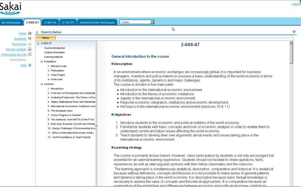
Open Syllabus is a tool which can be added to your list of tools in Sakai (as you would be adding the 'Files tool' or any other tool into CamTools).
The tool has been developed by HEC Montreal where it has also been incorporated into their Sakai version. CamTools however, doesn't have Open Syllabus in the list of tools yet, but if we see that people think it could be useful, it could be added to the list of available tools at some point.

Open Syllabus could be added as a tool in your CamTools site, and in that way it could solve some problems:
  • If all courses/departments use this tool, the headings and therefore all the syllabuses could be more standardised which makes it a much handier tool for students
  • It means it's enabled in CamTools which makes it handier for students if they're already working in CamTools: they don't have to visit extra websites just to see the syllabus
  • It's easy to immediately link readings/references to documents which are already in your CamTools site.


An example of how the Open Syllabus tool could be used


How is it used?

Open Syllabus isn't currently available in CamTools, but if we would get positive responses about it, it could be available at some point. Just as any other tool in CamTools, you would be able to add it to a CamTools site (just like adding the Files tool etc).
As it's not yet available in CamTools, we've set up a test site which you can access by using your Raven account. We've created a site for each of you, trying to simulate the existing sites in CamTools where you're already familiar with (e.g. if you're an admin of a site, we've tried to put some information in these test sites). Don't worry, you're the only one who'll be able to see your specific site so you can try out what you want in it.

As mentioned before, the Open Syllabus tool offers you some kind of template which could be the layout of a syllabus. The headings on the left (e.g. News, Presentation, Contact information and so on) can be changed once it would be running in CamTools. It allows you to add information in each sections, summing up the lectures and allowing you to immediately link to documents or websites. See it as a Wiki in the form of a Syllabus.
You can also enable the 'preview enrolled student version' which lets you see how students see it.


Step by step instructions

We've created a test site for each of you, reusing some of the same headings and information of a CamTools site where you might be familiar with. We've done that so it would imitate the CamTools feeling, allowing you to realise how it could look like in your own CamTools account.
Again, this is just some kind of prototype so some things might change if or might not work perfectly. Let us know your suggestions for improvement too.

  1. Visit the Open Syllabus test environment here
  2. You have to log in twice: First log in with your Raven account (you should be familiar with this process when you explored Thing 9 ), and after that you have to log in a second time in the right corner, again using your Raven account, but this time another password (check the email for Thing 11 for more details).
  3. You'll now land on 'My Workspace'; the landing page for this Open Syllabus test site. You'll see 2 tabs that are important for you: 1) the 'Opensyllabus Example site' which we have populated with OpenSyllabus examples, and 2) Your personal Open Syllabus test site which we have populated with possibly familiar CamTools information and where you can also try out the Open Syllabus tool yourself.
    The second site contains an already populated OpenSyllabus tool (you can just click through to get an idea), and some screenshots of HEC Montreal examples.
    Have a look at the 'Opensyllabus Example site' and read the announcement to get more guidance. Have a look at the clickable example (under the title 'OpenSyllabus'), and the HEC Montreal examples (under the title 'OpenSyllabus Examples') and try to get a general idea.
  4. Now go to the other tab (your own site). Actually the tools on the left side aren't that important; we mostly want you to focus on 'OpenSyllabus'. Click on that and try to use the OpenSyllabus template; populate it with information. It's good to keep a specific course in mind but obviously not all information as we just want you to get the general idea.

Blog Thing 11
  1. What do you think of ideas behind the Open Syllabus tool?
    What was you impression?
  2. In what ways do you see this being useful as a course organiser?
    Would you consider using it if it were available?
  3. Using OpenSyllabus, did you find it illuminating or frustrating?
    Are there any ways you would change it to better reflect what you want to do (e.g. wording/headings...)?
  4. How is your syllabus currently been set up? Is it online? Does it link to downloadable links or is it just a flat list? How do you compare OpenSyllabus with those?

If you're interested...
  • Now try to apply it to one of your own existing syllabuses: look up your online syllabus (or paper version if that's the only version you have), and use those details in the OpenSyllabus tool.

Tuesday, 26 April 2011

Thing 10 - Viewpoints

After completing Thing 10
  • You will know what Viewpoints is all about
  • You will have reflected on how it can be useful for you
  • You will have tried applying it to one of your own courses
What is Viewpoints?

Viewpoints is a tool developed by the JISC-funded curriculum design project at the University of Ulster. The tool can be used during or at the end of a course/lecture/module/term in order to assess and improve it..., or it can also be used before designing a new course/lecture/module... in order to help you focus on different (pedagogical) principles.
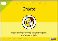
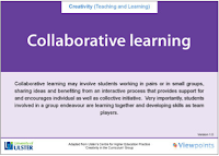
In order to do that, Viewpoints makes usage of a set of cards, divided into different categories (Assessment & Feedback, Information Skills, Learner Engagement, Creativity in the Curriculum).

Different sets of Viewpoint cards


Each category exists out of a set of cards which basically represent different specific aims, objectives or activities that can be undertaken to fulfill that pedagogical principle and that you could consider including in your curriculum. Each card can also be turned over, which uncovers a whole set of practical activities that can be done in order to reach that goal.

Click on the following links to have a look at the (front and back of the) different sets of cards:

Assessment & Feedback cards


Information Skills cards


Learner Engagement cards


Creativity in the Curriculum


How is it used?


There's the original idea of Viewpoints, which is using a set of paper cards. However, that paper version is not always easy to work with as it involves a lot of printing and lots of note taking etc. Therefore, CARET also made an online prototype version (so still a bit of work in progress) of those same cards.
Although there's the difference between paper and digitalised cards, the method and overall idea is still the same.

The Viewpoints cards are intended to be used during a collaborative exercise where a group of people related to the same course (course organisers, lecturers, and perhaps even other people) would sit around a table with 1) all the sets of cards spread out over the table, and 2) an A1 print out of a timeline worksheet. This timeline allows people to divide the course/package they're focusing on, into different time slots; these headings on the timeline could be in weeks (e.g. Week 1 or Week 1-5), by mentioning the terms (Michaelmas,...), by mentioning the name of the Module,... and so on.

The people around the table would then discuss and come to an agreement of what the different aspects should be that have to be included, following these steps:
  1. Explore, discuss and decide on cards
    The front side of all the cards are spread out over the table (somewhat clustered together), as well as the big timeline worksheet.
    First of all, the information on the timeline should be filled out (i.e. deciding what the different time definitions should be; weeks/ terms/ module name etc).
    Then the different cards should get explored by the members and by collaboratively brainstorming, the different cards get decided (e.g. one could choose to have 'Give assessment choice', and 'Encourage interaction and dialogue' and so on.)
    At the same time, these cards can already be connected to a specific timeslot (e.g. members could decide that it's better to have 'Encourage interaction and dialogue' in 'Week 2-5' for example).

  2. Turn over cards and decide on activities
    Once decided on the main 'action points' (i.e. the different cards and those being linked to a time slot), the selected cards get turned over.
    On the back of each card there's an overview of practical activities and tips you can undertake in order to achieve that main 'action point'.
    Again it's good if the participants collaborate, discuss and decide which activities should be selected for that action point. Realistically, you probably won't select all of the activities/tips, but probably about 3-5 maximum.
    As it's a discussion, it's possible the team decides to leave some cards out after all, and it's good to prioritise the activities too; i.e. which of the activities/tips will you do first or are more important?

  3. Collect activities and action points into a workable checklist
    You probably want to note down all these points where you'll be drawing attention to.
    The paper version of the Viewpoints cards is somewhat cumbersome because you would now need to write down everything in a workable checklist, which you can then afterwards incorporate into your other course documents.
    The online version is much easier in that aspect that it automatically collects the set of information you ticked and saved into a printable document.
Have a look at some Flickr pictures taken during such a workshop to get an idea how those steps work in real life.

Step by step instructions

The online version is still a prototype, which means not everything is there yet (for example, only the 'Assessment and Feedback' category is in there at the moment) and some things might not work smoothly enough for you yet.
Therefore, we'd like to hear how it works for you and what should definitely improve on the overall ideas. Ideally this whole Viewpoints exercise should be carried out as a group exercise as in reality, a curriculum won't be changed by just one person but by a whole group of people who're involved. However, for this exercise and just for you to get an idea of it, it's already useful to explore it on your own.
  1. Visit the online version of Viewpoints cards here.
  2. Imagine you'd like to change the curriculum design for your course/ module / lecture..., or you could think of an old one which could need some improvements.
    Fill out the arrangement (which basically stands for the name of the 'course/ project/ module etc').
  3. You'll now land on the arrangement tab, which is the place where you'll do the main bit of the exercise: defining the timeslots (terms/ weeks/ modules), choosing the cards by dragging and dropping them into the appropriate timeslot.
    Don't turn over the cards yet; this stage is really first about deciding on the big action points.
  4. Now turn over the cards, explore the different activities/tips and select the ones which are appropriate or which you think should defintely be included. Realistically, you'll probably just select about 3-5 items per card as selecting all the items isn't feasible.
    At this stage you can also still decide to leave out some cards by deleting them, if you think they're probably not appropriate after all.
    You can also drag an drop the cards, as well as the individual activities on the back of the cards, into the right order (i.e. the most important ones could be dragged to the top).
  5. Click the Finish button. You'll now see a checklist of all the items you selected. You can also save and print them out if you want.
If the steps above are not clear enough, you might want to look at the following demonstration of Viewpoints Online:


Blog Thing 10

Below are again some questions about this Thing.
As Viewpoints cards exists in a paper version as well as an online version, we'd like you to review the whole Viewpoints idea, with particular focus on the online version and how that could be improved. Feel free to give your honest feedback on any usability issues/problems or vague wording...things that confused you on the online version; or give a comparison for each...whatever suits you best.
  1. What do you think of the ideas behind Viewpoint cards?
    What was your impression (of the idea as well as the online version)?
  2. In what way do you see this being useful to you as a course organiser? Would you consider using it (either the cards or the online version) when you would (re)design a course?
  3. Using the online Viewpoints cards, did you find it illuminating or frustrating?
    Are there any ways you would change it to better reflect what you want to do (e.g. wording, whole idea or concepts that don't work for you)?
  4. What tools do you currently use when (re)designing a course? How do you compare Viewpoints with those you're already using?
If you're interested...
  • Currently the online prototype has the biggest category in there (Feedback & Assessment).
    Have a look at the other sets of cards as well, which you'll find in the beginning of this blogpost.
    Do these sets (and the specific activities and hints at the back of the cards) make sense to you? Do you think they're useful for you or Cambridge needs?

Wednesday, 20 April 2011

Thing 9 - CamTools

After completing Thing 9
  • You will know what CamTools is all about (if you didn't already)
  • You will have tried out some tools within CamTools & have reflected on how they can be useful for you
  • You will have tried to embed some of the previous Things in your CamTools site
What is CamTools?

CamTools is a Virtual Learning Environment or platform used at the University of Cambridge; it's a collection of online tools to help you communicate and share materials with selected students, researchers, administrators, other lecturers, college groups and so on, by building up password-protected 'sites'. CamTools is based on the Sakai software, developed in collaboration with other Universities worldwide. This means you might recognise the functionalities in platforms other Universities are using as well, but maybe with a slightly different look, branding and so on.

The CamTools log in page: use the Raven button if you're a University member


Once logged in, you'll see your CamTools Dashboard with an overview of Sites you're a member of


An example of a site after entering it


People who have a Raven account can create a new site in CamTools to share lecture materials and information with students, fellow supervisors and lecturers, create a project site to collaborate with colleagues within a college or the University. You can also invite collaborators from outside Cambridge University to join your site, or make sites available for any Cambridge University member to join.
Although CamTools isn't focusing on Curriculum Design in the first instance, we wanted to introduce this to you in this programme anyway because CamTools is something that most Cambridge University members are already familiar with, and because we want to give you the opportunity to invest how CamTools can actually be used in a better way for curriculum design purposes.

How is it used?

When using CamTools, you might want to use it for different purposes. In order to answer that need, CamTools uses a functionality called 'Tools'. As there are different needs, there are also different Tools, such as the Files tool (to upload, download, share different kinds of files and resources), the Wiki tool (where you can type up any kind of text), the Forum tool, Blogs, Polls, and so on.

When focusing on Curriculum Design specifically, there are again some Tools that might be used to better meet that need. For example, if you would wish to organise and share course preparations with other lecturers, you could use the Files or Resources tool for that; or if you would wish to type up some preparations and some of your pedagogical practices, you could keep a record of that in the Wiki.
as well keep a record of that in the Wiki. You could also add some of the Things that you've been introduced to during the 13Things programme into a site.

Have a look at the following video of how you could use CamTools to fulfill some curriculum design needs:


Step by step instructions

We've created a CamTools test site for each of you (more information about it below), which means you can try out anything you like in this site; if there aren't any members added to your site, you will be the only one to see the things you're doing with it. If you already have a CamTools site with students added to it (e.g. for your course), then this is the way to try out some tools without them seeing it!
  1. Visit CamTools here
  2. Log in using your Raven account (as you're a member of the University, you should have a Raven account but if you don't have one, let us know).
    (Hint: if you're having problems logging in, have a look at this Tutorial)
  3. Once logged in, you should arrive on your Dashboard where you'll find a list of your Courses and Projects. Go and find the test site that we've set up for each of you (with the name '13 Things test site - your crsID ). Don't be surprised there isn't that much in your site: it's just a default set of tools and it's up to you to populate it with things you like.
    Get yourself familiar with this CamTools site and with CamTools in general (Dashboard etc) if you haven't used it much before.
  4. There are different tools you can try out, but for this task we'll just guide you through some of which we think might be of interest for curriculum design.

    Say you want to have some of the 13Things added to your CamTools site because they are an easy way to quickly assess some aspects of your course; you can add those websites to your CamTools site.

    The way to do that is the following:
    • Click on the title of your specific test site
    • Click on 'Site Info' on the left side
    • Click 'Edit Tools' in the top bar and now click 'Web Content' in the list
      (if you would want to have more tools added to your site, you can just tick those you want), click continue.
    • Add the URL of the website you want to add (e.g. the Pedagogy Profile Widget, http://www.rjid.com/open/pedagogy/html/pedagogy_profile_1_2.html), and fill in the Title as you want it to appear in your CamTools site navigation on the left (e.g. Pedagogy Profile Widget).
    • Click the 'More Web Content Tools' drop down if you wish to add even more sites and do the same thing as you did for the previous website. (e.g. you could do the same for Phoebe http://www.phoebe.ox.ac.uk/, CloudWorks http://cloudworks.ac.uk/ and the other online tools we've come across).

  5. Imagine you would want to have those Web Content Tools (i.e. Phoebe, Cloudworks etc) in your site in order to manage your curriculum design for each course in an easy and quick way (so that you wouldn't need to access each individual website separately), but you wouldn't want your students or other members of your site to see those Web Content Tools in your site if they're also member of that CamTools site.
    In order to do that, you can 'hide' some tools in CamTools, so that only the maintainers of a site can see those tools but students can't.

    The way to do that is the following:
    • Click on 'Site Info'
    • Click on 'Page Order' in the top bar
    • Click on the yellow light bulbs next to the name of the tools you would want to hide for non-maintainers
    • Click 'save'

  6. Other Tools you might be interested in, are 'Files' or 'Resources' (both are for uploading, downloading, sharing files and resources, but Resources is for slightly more advanced usage), and the Wiki tool. Have a look at those tools as well and play around with them.
    (Hint: Have a look at the Files Tool Tutorial if you're having problems using it, and have a look at the Wiki Guide if you're having problems using the Wiki Tool. We don't expect you to investigate it in such a thorough way, but you can do if you want to).
Blog Thing 9
  1. What do you think of the ideas behind CamTools (Sakai)?
    What was your impression? If you already used CamTools before, did it change your opinion?
  2. In what ways do you see this being useful to you as a course organiser? (i.e specifically about the ability of letting you pull together and use various curriculum design tools?)
  3. What would you like to see from CamTools?
  4. What do you think of the possibility of having a specific CamTools site where lecturers and course organisers could share curriculum design outcomes, preparations and ideas? (e.g. a specific CamTools site that would allow you to do that?)
If you're interested...

During the 'Step by Step instructions', we just introduced you to some tools that could be useful for Curriculum Design. There are many more tools though, that could as well be useful for teaching in general.
  • Try out more of the other tools. If you only have other sites in CamTools where there are already many more members part of, this is a good opportunity for you to try out those tools without having other people seeing what you're doing with it.
    If you get stuck at some point and would need some help, have a look at the Help Tutorials or written guides.
  • If you want to know how students would see you site, and to check whether they really can't see the hidden tools, you can always add a 'fake user', by adding one of your own email addresses as a Friend user. By default, they would have most of the permissions set as a student would. You can try it out yourself how to do this, but if you're not sure how to do this, it's good to have a look at item 8.2 in the Administrator's Guide for CamTools.

Tuesday, 19 April 2011

Thing 8 - Compendium LD

After completing Thing 8
  • You will know what Compendium LD is all about
  • You will have reflected on how it can be useful for you
  • You will have tried applying it to one of your own courses

What is Compendium LD?

Compendium LD is one of the tools that has been developed by the Open University Learning Design Initiative. It's a tool for helping teachers and designers to create and visually represent their learning designs, using a technique that's based on visual mapping techniques such as mind maps, concept mapping and so on.
If you've never heard of one of these techniques, it's worth having a look at the Wikipedia page on mind mapping for a perfectly acceptable definition.

One of the key aspects of 'mapping techniques' is that it prompts users to think thoroughly about what they're writing down, which means, in theory, you would also think things through more when using Compendium LD.This visualisation tool also maps the items of your course in a non-lineair (brainstorm type of) way, which is quite different to other tools you might already be using.
An example of how Compendium LD could be used

How is it used?

Compendium LD is a software toolkit which means you have to download it in order to use it. The tool provides a set of icons to represent the components of actors (e.g. students, tutors, lecturers etc), who perform actions (i.e. learning tasks such as discussion,...), making use of tools (e.g. forums, wikis,...) and resources (e.g. course texts). These icons can be dragged and dropped, and connected to form a map of nodes.

An overview of some of the icons and how they can be used


Have a look at the video below to get an idea of how these icons and Compendium LD in general are used:


If the previous video is not making you any wiser, then you might have a look at the following presentation on SlideshareDoing More With Compendium Ld


Step by step instructions

  1. Visit Compendium LD here
  2. Download the Software toolkit by clicking on 'Download' on the left hand side.
    You'll have to fill out some contact information, but again don't worry about being spammed or anything; the Compendium LD team just wants to keep a record of who and why people are using it.
    (Hint: If you're having problems downloading the toolkit, have a look at their Help pages)
  3. Once having downloaded, open the Compendium LD toolkit.
    Have a look around and play around with the icons to get an idea of how to use the system.
    Hint: If you're not sure how to use it, have a look at the videos above, or at these documentation pages)
  4. Think of one of your (previous or upcoming) lectures (or courses) and try to use Compendium LD for preparing a lesson plan. Think of the roles, the different activities and so on. You don't have to click any 'Save' button as the system is saving automatically from time to time.

Blog Thing 8
  1. What do you think of the ideas behind Compendium LD? What was your impression?
  2. In what way do you see this being useful to you as a course organiser?
  3. Filling out one of your own Compendium LD course visualisations, did you find it illuminating or frustrating? Are there any ways you would change it to better reflect what you do?
  4. How do you compare it with other visualisation tools for curriculum design (e.g. compared to others introduced in this programme such as Course Map, Phoebe ... or others that you already use yourself)?
If you're interested...

If you're interested, there are some more sophisticated things you can do with Compendium LD.
  • Upload the visualisation you just made as an image.
  • You can also add the 'time aspect' to your visualisation by editing the version you just made, or by creating another one.
    The video on their Documentation section should give you an idea of what you can do more with it.

Thursday, 14 April 2011

Thing 7 - Phoebe

After completing Thing 7
  • You will know what 'Phoebe' is for
  • You will have investigated Phoebe's built-in and user contributed design templates
  • You will have reflected on how useful it could be for you
What is Phoebe?

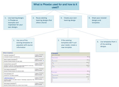
Phoebe is an online tool intended to encourage university teachers to explore new approaches and tools in their pedagogy.  It does this by providing online course design templates, which course designers fill out with the help of accompanying suggestions and examples.

The templates are basically forms, with a series of sections and text boxes into which information concerning aspects of the course is entered.  Each section and text box can have supporting information associated with it and displayed during editing to help the designer.  The built-in templates are mostly about design at the class or lecture level and draw on course design resources developed by the Phoebe team specifically to accompany them, but it is equally straightforward to link to other resources. 

The different templates are provided to suit different kinds of course and levels of detail.  Some are built in, but many have been created and shared by other course designers. 

To make a new course design, you choose an appropriate template, click the 'create new design' button and set about filling in the various text boxes, aided by the prompts and help text.  For this the screen is split in half, with the template on the right side and wiki pages on pedagogic practices on the left. Alternative views are available in case you prefer them to the split-screen layout. 

Phoebe could be helpful on a number of levels.  By requiring a particular set of fields a template can help designers break design problems down in a tractable way, make designs more comparable and explicit, and prompt designers to consider aspects they might have overlooked. 

Created at Oxford University, Phoebe is a prototype and is not being developed any further, but it is still live and usable.  The ideas and benefits of Phoebe could be obtained in a variety of other ways also, but being open source it would be possible to have a version just for Cambridge.


How is it used?

Don't let Phoebe's  overwhelmed by the wordiness of the Phoebe system, once you've understood what it's about, it's really not that hard. This is usually the case with many online systems anyway. Have a look at the video below to get an idea of how Phoebe is used:


Step by step instructions

  1. Visit Phoebe here
  2. So that you can create and save templates and learning designs create an account by clicking on Register/Login at the top of the page and filling out the various fields. You won't be spammed.
  3. Log in
  4. Click on 'Manage your design templates'. You'll see a section called 'Other's templates', which is the list of all the public design templates. Some of them are created by the Oxford Phoebe team, others are made by users and made public. 
  5. Chose one or more templates to try for yourself (you might be interested in 'Cambridge Course handbook').  Click the 'create a design based on this template' button for your favoured template.  You will be asked to give your new design a name and description and then you will be placed in the design environment, complete with support material.
  6. Try out the design editing environment for yourself.  Click the 'click for guidance', 'click for book' and 'click for example' buttons to call up associated help for each field.

Blog Thing 7
  1. What was your initial reaction to the idea of standard template forms with built-in help, as curriculum design tools?
  2. After having tried it yourself,  how did your impressions change?
  3. Which template(s) did you think were useful?  Would you consider creating a template yourself?
  4. If you looked at a new design using the Cambridge Course Handbook template, how well do you think it could the module design process, or to improve the consistency of module information, or both? 
  5. What are your thoughts about using a standard to share Cambridge (or your course) specific templates and designs; as a tool to share your learning designs?

If you're interested
  • Create a new design based on one of the templates and try using it to describe a course you are familiar with. When you're done, make it public and tell us its name in your blog.
  • Create a template yourself: specific to Cambridge or even to your course. When you're done, make it public and tell us its name in your blog.

Friday, 8 April 2011

Halfway hall

Halfway Hall is how students in Cambridge celebrate the mid-point of term, so in that jubilant spirit our most recent meetup marks Thing 7-and-a-half of our 13 curriculum design Things programme. It was great to catch up with six of our busy participants face to face.

Halfway hall in one of the newer colleges? http://www.flickr.com/photos/nico_/2683453892/

This was a informal meetup and the aim was to catch up on each others' thinking about the Things so far, let everyone know what's coming up next, and to get some feedback ourselves the programme so far.

There was a great discussion about the Things so far and how they might work at Cambridge, and we heard many things we haven't seen in the blogs yet, probably, it was suggested, because being able to discuss them face to face is much more stimulating.  If you're reading this and wondering whether to come to the next meetup, this is your notice that the meetups are the most useful bit!

We'll be including this feedback and discussion in our summary of feedback at the end of 13Things.

In terms of the pace of the programme so far not everyone has had time to keep up with two things a week, so we're going to add some extra time at the end so that there's a chance to catch when exam season is behind us.

Keep it up, and we look forward to more fascinating posts!

Thing 6 - BYO

After completing Thing 6
  • You will have shared and described a curriculum design Thing you're using yourself

What do we understand under this 'Bring Your Own' exercise?

During the previous weeks you already got to know 5 Things to do with curriculum design, and we'll introduce you to some more in the coming weeks.
But for this Thing, we're interested in curriculum design Things that YOU are already using.
This could be any kind of tool, system, resource, guide and so on that you're using to help you with your curriculum design.
Just like we've been describing the what and how of the previous Things, we'd be interested to understand what your Thing is about, and how it's being used as well.

What tools do you use to help with curriculum design?

Blog Thing 6
  1. What is your BYO curriculum design Thing that you choose to share with us?
    Describe what sort of Thing it is (tool, resource, guide, system etc), what it aims to do and how it's being used.
  2. How did you find out about this (via a colleague, through training session...)?
  3. Why is it particularly useful for you? What aspects are less useful (for you)?
  4. In what way do you you see it being useful for other course designers?
  5. Add a link / image / upload a version so it's clear what the Thing is and other participants can try it out as well.

If you're interested...

  • Are there more curriculum design tools that you're using? Don't hesitate to add them too!
  • Which of the previous Things you mentioned are most useful in what situation?
  • Do you know any tools that your colleagues are using which are worth mentioning?

Tuesday, 5 April 2011

Thing 5 - Pedagogy Profile

After completing Thing 5
  • You will know what the 'pedagogy profile widget' is all about
  • You will have tried applying it to one of your own courses
  • You'll know whether it can be useful for you

What is the 'Pedagogy profile widget'?

The 'pedagogy profile widget' is another way of visualising the make-up of a course, developed at the Open University. The tool is designed to help instructors analyse their course by collecting its many student activities into seven categories. The time assigned to activities in each category is summed, giving a bar chart which shows the spread of types of activities within the course. The categories are derived from a learning activity taxonomy developed by Prof. GrĂ¡inne Conole at the OU that characterises the types of tasks learners undertake into six types of learning activity, plus assessment:
  • Assimilative: attending and 'understanding' content, such as reading, viewing or listening
  • Information Handling: e.g. gathering and classifying resourcing or manipulating data
  • Communication: dialogic activities, e.g. pair dialogues or group based discussions
  • Productive: Construction of an artefact such as a written essay, new chemical compound, sculpture etc)
  • Experiential: practicing skills in a particular context or undertaking an investigation
  • Adaptive: use of modeling or simulation software
  • Assessment: diagnostic, formative or summative


How is it used?

It's an online system which means you but you can download the results as .jpeg, or print it out. You can also 'save the data' so that next time you visit the URL, the information is still visible in the same way. The aim of the tool is to give course designers a way to assess the balance of activities across different ways of engaging with the material, but also to get an overview of the total time spent engaged in each kind of activity, and to make courses comparable in these terms. It is intended to apply equally to courses in development and established courses.

Step by step instructions

  1. Visit the 'Pedagogy Profile Widget' here
  2. Try it out for your own course, or a part of it, e.g. a single unit or lecture. You could reflect on a single course from some weeks ago, on a whole lesson package from last term, or maybe even on a course or lesson package you're planning to give in the near future as way to assess it before actually lecturing. Each row represents a chunk of your course - you decide what size chunks you want to use, depending on the scale of the course you want to analyse. A Tripos Part might be best broken down by terms, a single lecture by minutes, a module by lectures and labs. You can give your chunks titles by clicking in the appropriate row headers on the left of the table (e.g. lesson 1: xxx). For each chunk you then fill in the amount of time spent in each type of activity. Units are whatever makes sense for you, but hours are often effective. Fill in each of the cells in the matrix. Click 'add' or 'delete' to vary the number of rows. Click update to see the completed profile. Profiles can be printed or saved as .jpegs and uploaded.
  3. Done! Now blog about what you think.


    Examples:


    Could be divided into weeks...


    or in modules...


    or in terms... or in whatever you think suits you best!


Blog Thing 5
  1. What do you think of the idea of 'pedagogy profile widget'?
  2. What do you think of dividing the rows into 'modules', 'terms' and so on; or do you think the original idea of using 'weeks' works best?
  3. How does it compare with any other methods you're using to balance learning aspects across the spread of activities etc?
  4. Filling out your own pedagogy profile, did you find it illuminating or frustrating? Are there any ways you would change it to better reflect what you do?
  5. In what ways do you see this being useful to you as a course designer?
If you're interested...
  • Add the .jpg of your own 'Pedagogy profile' to your blog post (hint: use the 'save as .jpg' button and afterwards upload it to your blog post using the 'image' icon in your blog )
  • Look up 'Pedagogy profile' on Cloudworks (here's a link) and share your response directly with the OULDI team there

Wednesday, 30 March 2011

Thing 4 - Course Map

After completing Thing 4
  • You will know what the 'course map view' is all about
  • You will have tried applying it to one of your own courses
  • You'll know whether it can be useful for you

What is Course Map?

Our friends at OULDI have been developing ways of making learning designs more visually accessible.  The course map view is one of the simplest 'views' and is intended to give an at a glance overview in terms of the types of learning activities the learner is undertaking, how they will communicate and collaborate with tutor and peers, the guidance and support provided and the nature of any assessment.

The four categories have been carefully chosen to capture all the main elements of a course - setting them out in boxes is just a sort of visual mnemonic.  They may seem familiar to you - they're a lot like the headings found in course handbooks, and many instructional training courses use similar categories.

The bottom two boxes are there to help other people identify the course and place it in context.

How is it used?
(cc) http://sha3teely.com/?p=117

If you're developing an idea for a new module, or reviewing an existing one, you could use a course map to create handy overview.  Course maps can be used as a sort of checklist: are all the elements in place?  They're also easy to share.  Being consistent, they can aid comparison - creating course maps for several modules in a larger course can act as an aid to reflection on the whole set.

Check out an example: the University of Reading's third-year Atmospheric Science field course


(c) ReadingLDI

Step by step instructions

  1. Grab a blank sheet of paper and make a course map overview of your own course.  It might help to have a particular audience in mind.  If you like, you can get an editable blank version from Slideshare (account needed) or via CamTools.
  2. You're done!  Just blog what you think.

Blog Thing 4
  1. What do you think of the idea of Course Map?  
  2. How does it compare with any other representations you have of your course?
  3. Filling out your own course map, did you find it illuminating or frustrating?  Are there any ways you would change it to better reflect what you do? 
  4. In what ways do you see this being useful to you as a course designer?

If you're interested..
  • Check out the thinking behind the course map on Prof. GrĂ¡inne Conole's blog e4innovation
  • Add your own course map to your blog post (hint: scan it in, save your PowerPoint file as a picture, or just take a screenshot in Windows or Mac and after that upload the image)
  • Look up 'course map' on Cloudworks (hint: use the search box, or just click here) and share your response directly with the OULDI team there